HYPHEN PRESS
BRIEF
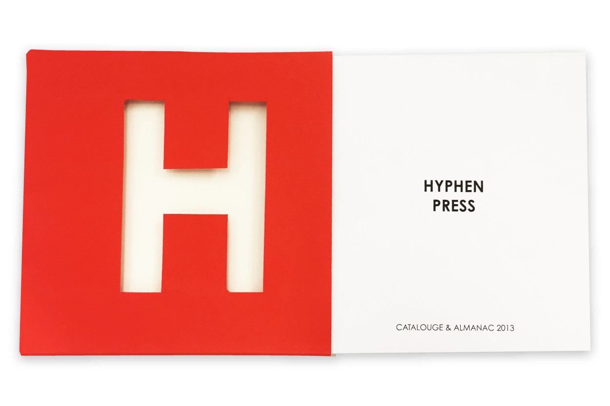
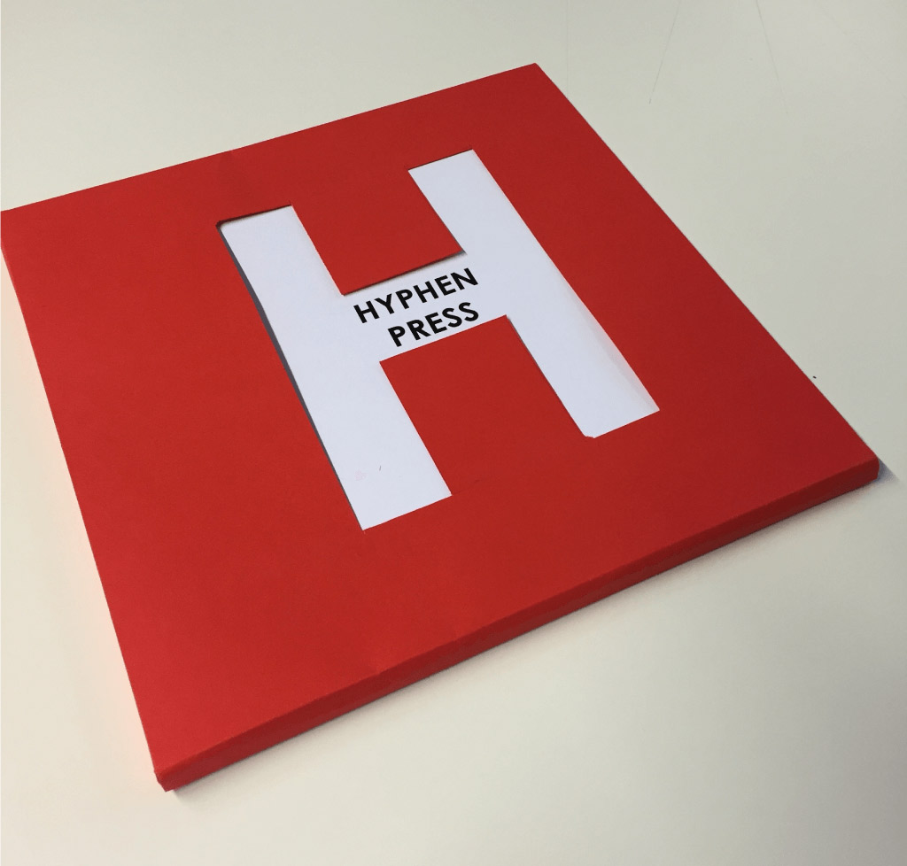
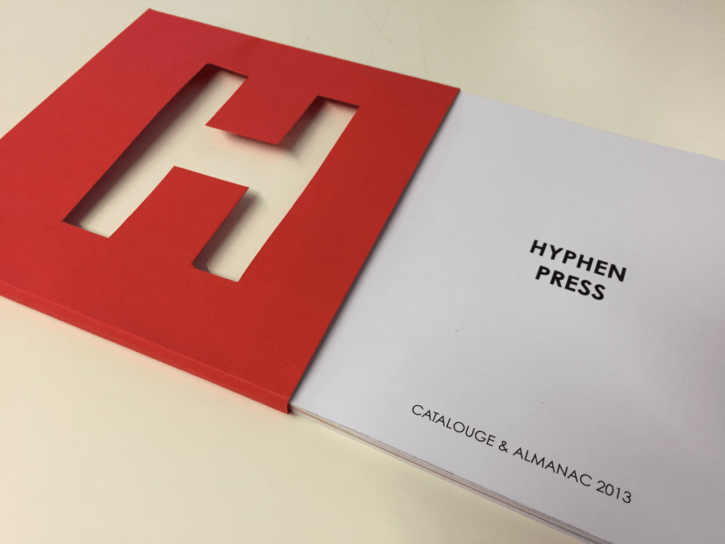
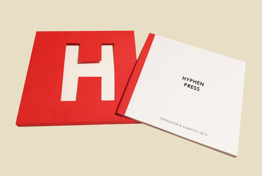
To redesign the Hyphen Press Catalogue, and to find a way to create an hierarchy in the layouts and to develop a more consistent image for the book as a whole, starting from the typeface selection to the binding.
CLIENT / SCHOOL / COURSE
Hyphen Press / SPD / Typography
TYPE - Editorial Typography
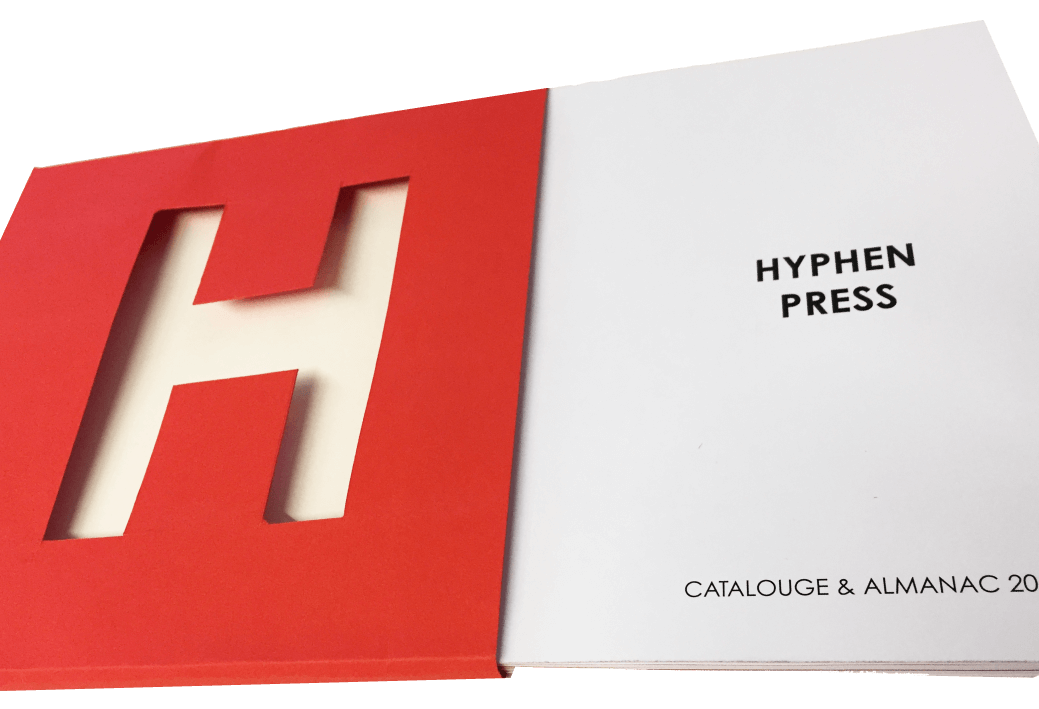
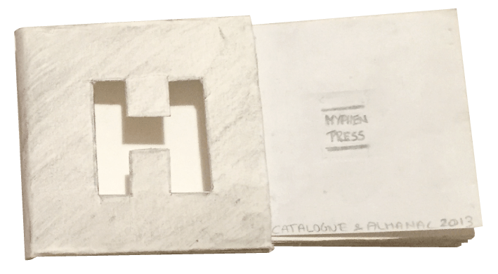
Miniature Sample Book
Font Choices
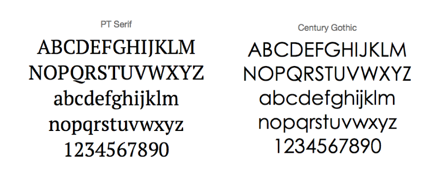
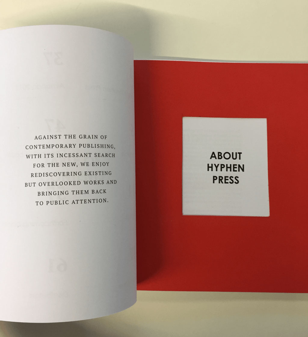
The typefaces used are PT Serif and Century Gothic. I wanted a clear differentiation in the two typefaces, that being the most important reason to chose a serif and a san serif typeface. A serif typeface for the running text as serif’s make the letters more distinctive and readable in print and a San serif typeface for the headings and some running texts.
The Catalouge
To get in touch
Feel free to reach out to me at