Sales officer app
QUICK INTRO
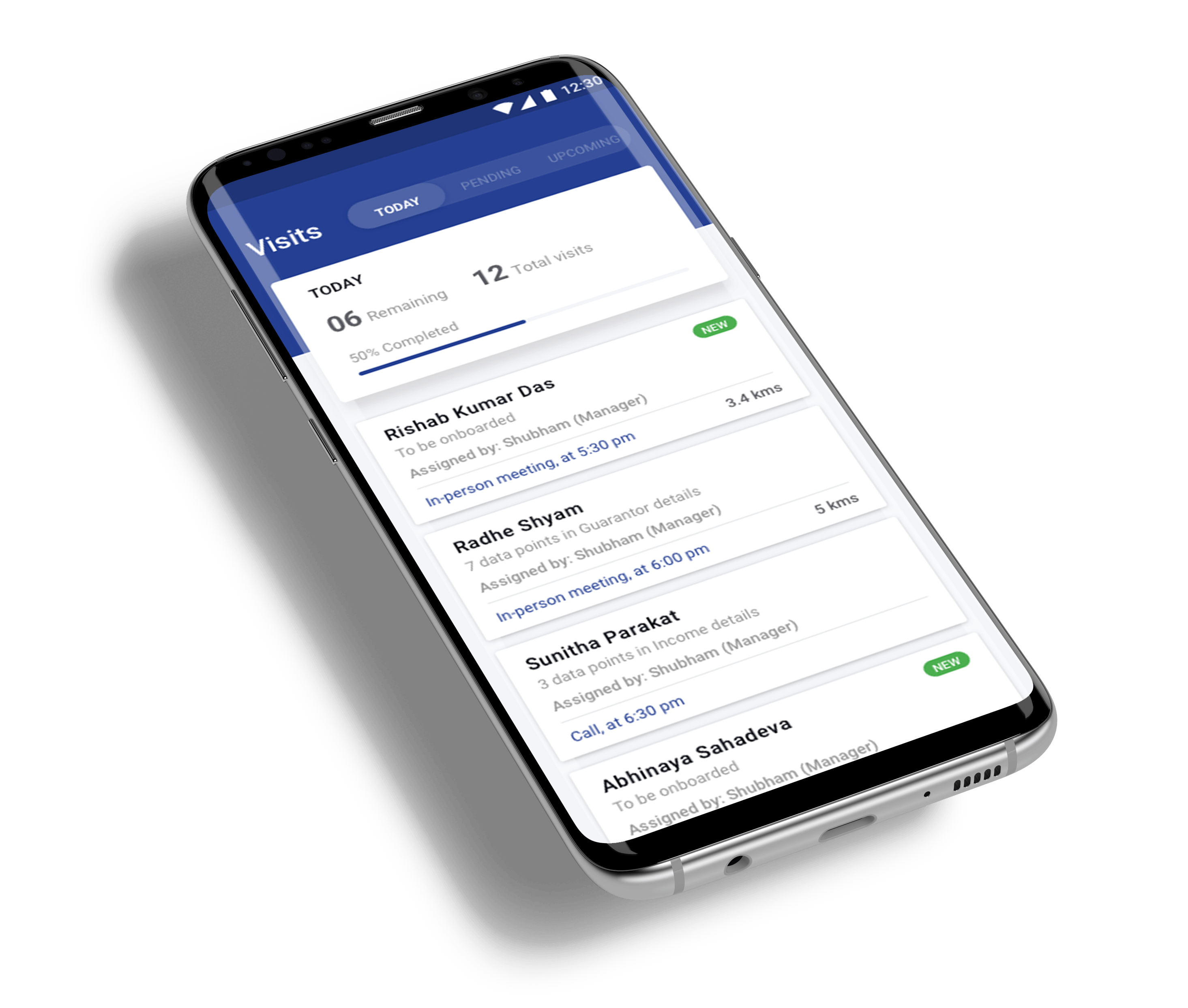
The goal was to design a mobile app solution for the sales officers working in Financial Institutions and NBFCs.
COMPANY / ROLE
Loktra / UI & UX
Problem statement
Sales officers main role involves executing all the visits/tasks assigned to them by their managers and also fetch new business (leads). In the current scenario, allocation of tasks/leads happens over whatsapp, email and face-to-face daily scrum meetings. This makes it very difficult for the SO to keep a track of all their leads, their statuses and the tasks assigned. At the end of the day their only motto is to be able to bring more new leads and to complete all the tasks assigned to them in the shortest span and push the customer to the next phase of the lending cycle.
Design process
1. Field visits & user interview
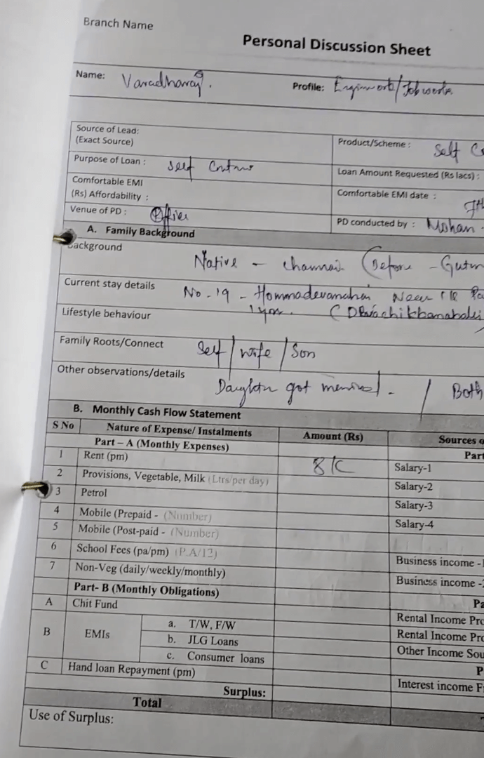
To understand the users and identify their pain points, my PM and I went to a few field visits with the sales officers to analyse how they were using the current process to achieve their goals and execute tasks.The journey is a mixture of physical and digital touch points starting from lead generation to the loan disbursement phase. They fill all the customer data using physical forms and then a relationship officer manually updates them on their web panel, the main pain point here is that there are many data points that get misfilled because of the information being updated by a different person. It’s also time-consuming and there is no way to keep track of all their tasks in one go.
2. Information architecture
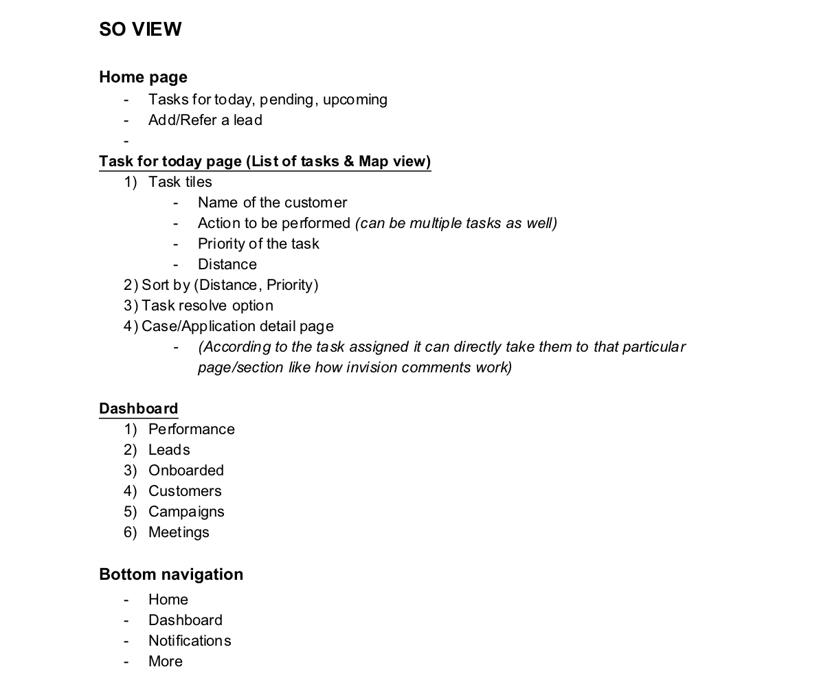
Based on the information we collected during our research, PM and I came up with various feature sets and started prioritising them with respect different use cases.
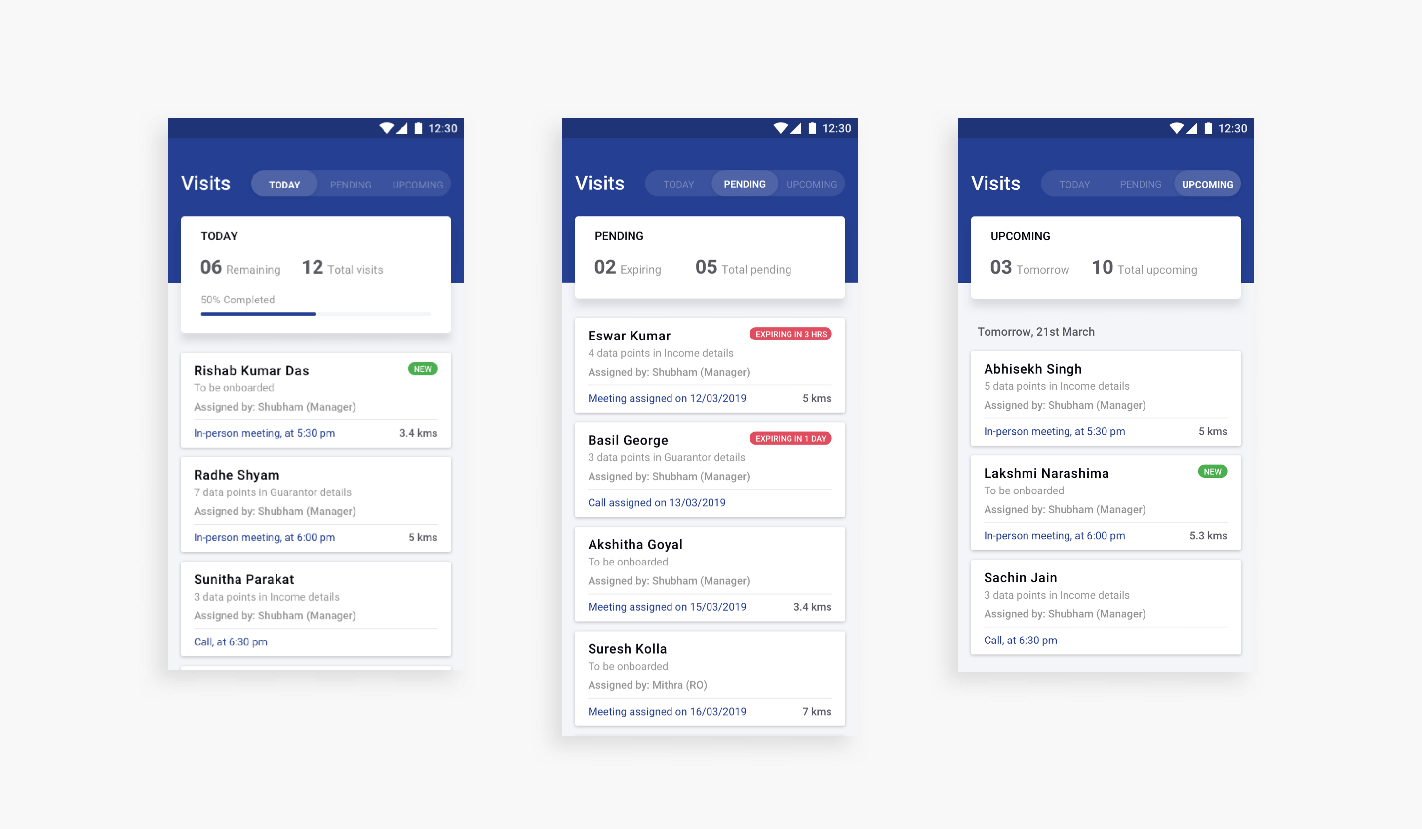
The parent elements that I defined are visits, dashboard, notifications and more. In the visits view all the tasks assigned to them are listed under three buckets (Today, pending, upcoming) with today being the primary view. The dashboard view will give an overview about their performance and nudge them to perform better.

3. Wireframes
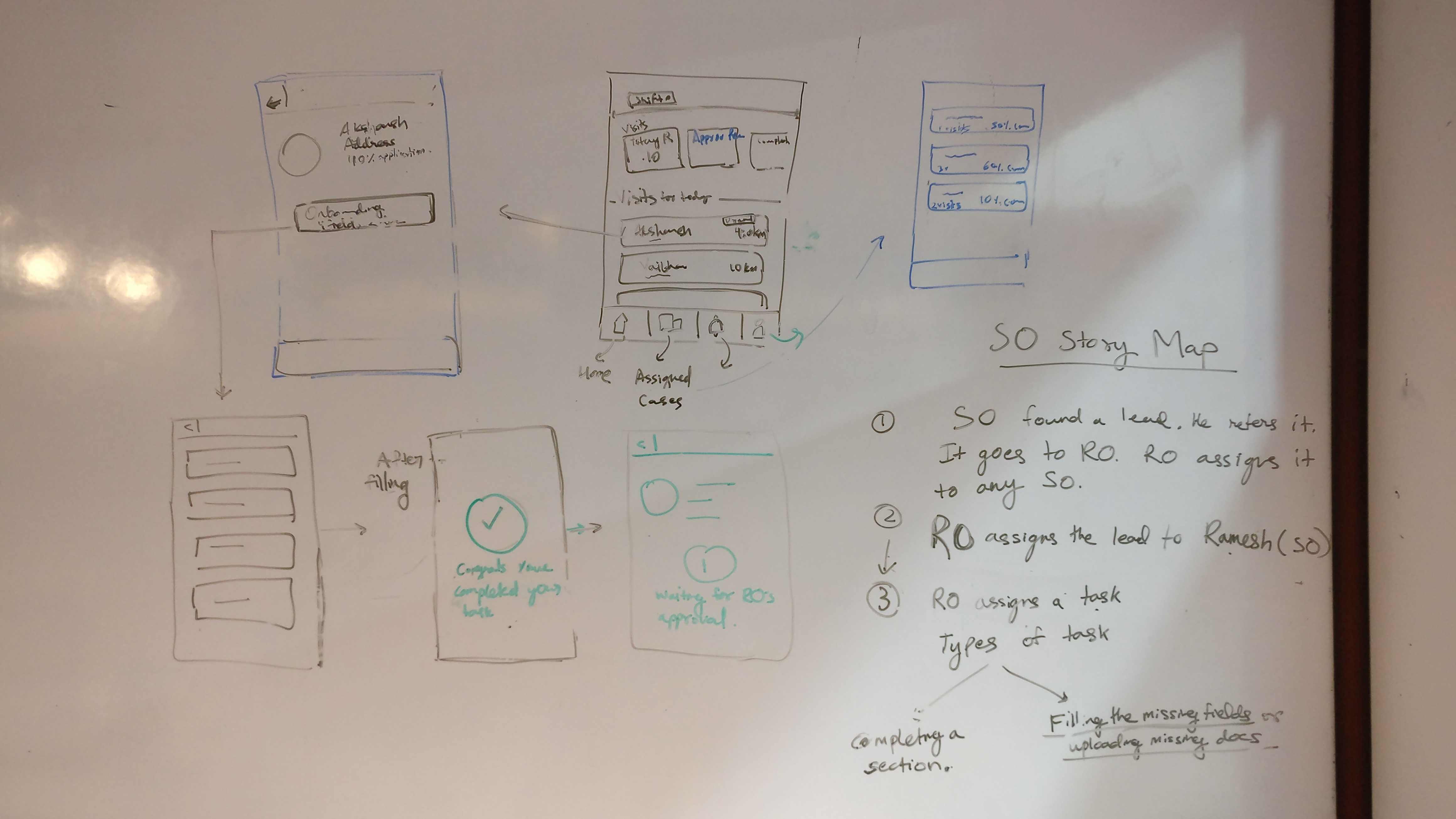
After getting clarity on the information architecture, I started sketching the user journey on the white board to envision how the interface will look like. After back and forth discussions and feedback sessions with my PM on the structure of the app’s interface, I moved to high-fidelity wireframing.
As I was working on the hi-fi wireframes, I kept taking multiple feedback from the sales officers and relationship managers at various stages and kept iterating with respect to their feedback.

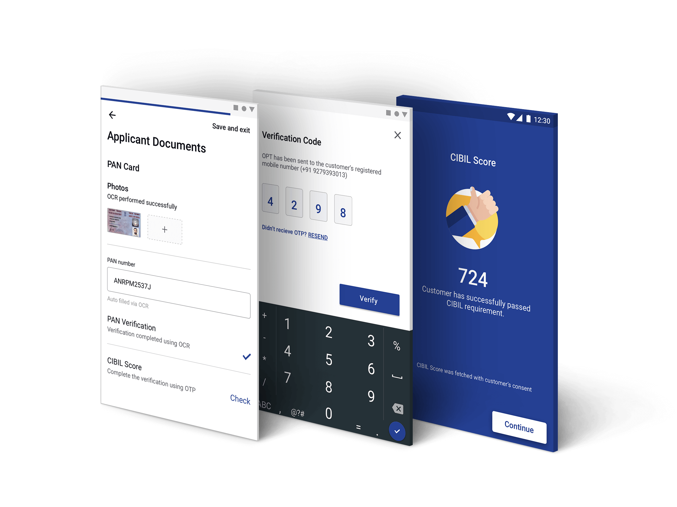
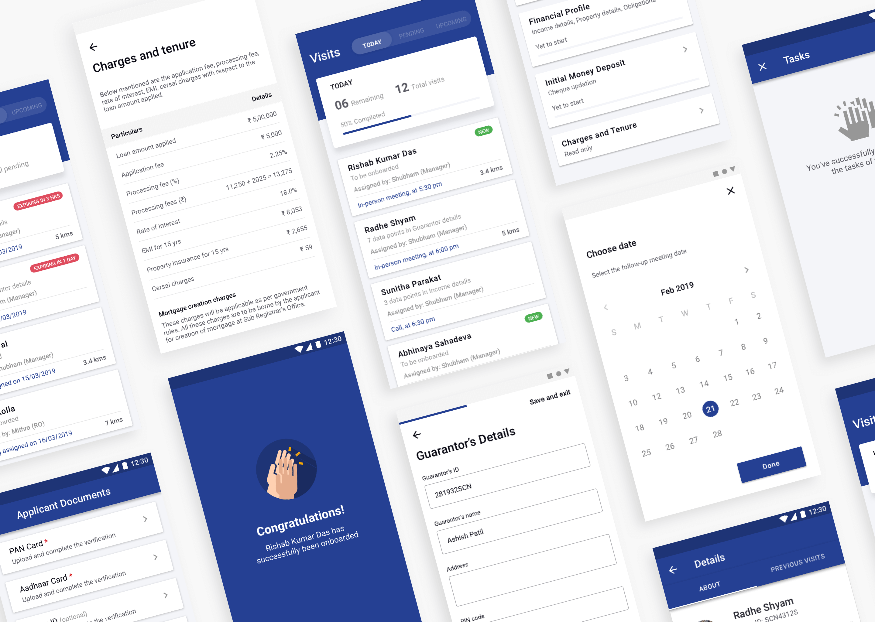
4. Final visual design
To get in touch
Feel free to reach out to me at